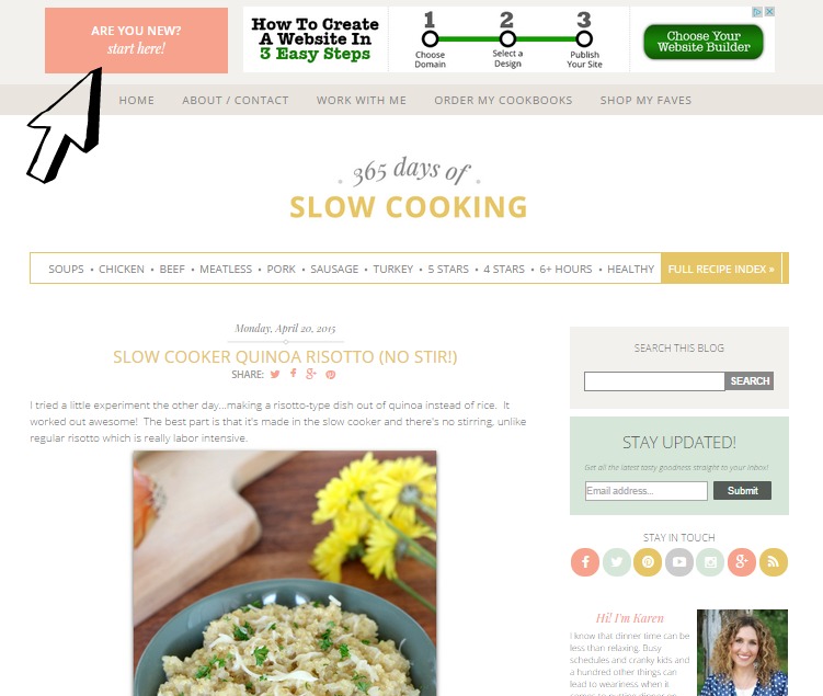
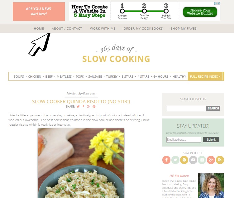
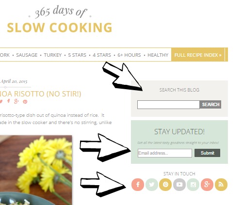
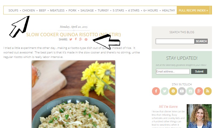
Now if you’re on your mobile phone you’re probably saying “um, the blog I’m looking at doesn’t look like the one in those screenshots!”
You’re right. It doesn’t. It’s a “mobile friendly version.” But you can see all the helpful share buttons, sidebar information, recipe index stuff as long as you keep scrolling down. It’s all there!
I’m working on making my recipe index better so stick with me until I do! For now, on mobile the best way to see the recipe index is in a horizontal view.
If you’re on a tablet like an IPad, you’ll want to tilt the tablet horizontally. Then it will show up like the desktop version with all the helpful features at the touch of a finger.
Comments? Questions? Comment here on this post if you have a suggestion of something I should add to my blog! I’d love to hear from you.
Shout out to Fran from Free Borboleta for making this new and beautiful design happen!
Thanks for stopping by! You’re awesome 🙂

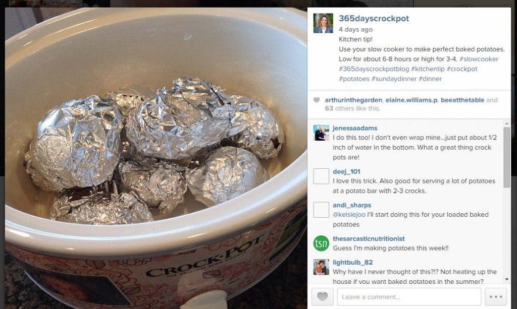
P.S. For a behind the scenes look at my life and blog, follow me on instagram!
Love it Karen!
Looooking Goood! I know how hard you worked on this….just glad it's up and running
Thanks Andrea!